Spatial Operating System Revealed at North By North East Interactive
I had the pleasure of writing an article about a fascinating presentation I heard at the North by North East Interactive conference in the spring of 2013. It was a originally posted on a high-traffic blog called createdigitalmotion.com, produced out of Berlin. You can read the post below.
—
During the North by North East Interactive conference (NXNEi) in Toronto When Steve Mason from Obscura Digital described the new design of the spatial operating system that he is developing, his speech was inflected with enthusiasm.
It is the latest project that this VP of innovation at the San Francisco based company has developed in partnership with furniture giant, Haworth. Together they formed Bluescape, to launch their new multi-user touchscreen platform designed for collaboration without borders, aiming to accelerate innovation and drive results. With a big price tag for all of the components in their system, they’re hoping their first customer will be a motion picture company that can afford the cutting-edge luxury product.
During Steve’s talk at the NXNEi conference, he discussed the many challenges and rewards of working on the project: how to design for a more corporate user and how to create an entirely new operating system for true collaboration – Not an easy undertaking.
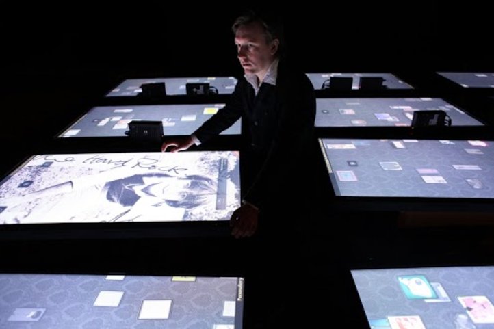
Even though Obscura Digital has created complex architectural mappings on the exterior of buildings, for example the sacred Islamic geometry on the outside of the Sheikh Zayed Mosque in Abu Dhabi, a 360-degree mapping on the interior of the Guggenheim, and a touchscreen artifact viewer at the Hard Rock Café, this project was entirely different and posed new challenges for the Obscura team.
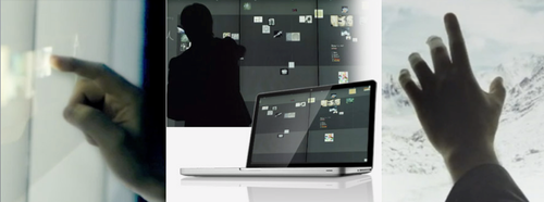
In order to design functionally, Steve said they needed to think about “not just transposing something from a desktop to a wall. Like a cell phone versus a smartphone, we need it to actually work differently.”
“We built a framework of key elements… A large-format with infinite workspace – not like a white board that you have to erase and reuse again,” said Steve. “It had to enable real-time collaboration; be visible immediately remotely; include natural handwriting, for either drawing or writing; It had to be open and extensible and not monolithic, but a platform with an ecosystem of developers who can work on apps suitable for the technology, so we get a critical mass of adoption. And finally, it needed a broad appeal, so that it wasn’t too technical, and it didn’t require specialized knowledge to use it.”
“As we worked, roles and issues emerged. We had to be sure that the system was fault intolerant. The apps couldn’t crash… We knew the system needed to have resilience.”
Their system is running at 60 frames per second, with a resolution of 15,360 x 3240, and uses a single node configuration so that there’s one computer that outputs to 24 displays connected to make the large touchscreen.
“The reason the screens are so expensive is that they’re handmade. They’re actually Samsung monitors with an camera array behind them, and a small computer inside.”
They even figured out how to configure synchronized rendering, with help from an Apple guy, and a graphics guru.
Once they got the technology working, Steve explained “We wanted to design the system to support and enhance collaborative behaviours around the capture of expression and synthesis of thoughts. We had to think a lot about the behaviours people exhibit when they collaborate, in order to design our ecosystem.”
“When people collaborate they are capturing and gathering (referencing imagery and concept art), sharing, facilitating (framing challenges, moderating conversation, clustering notes and synthesizing content),” explained Steve.
The team went with a black wall and the idea of post-it notes, with some guardrails for color choices: 5 colors of notes, with a secondary color pack of 10.
Skeuomorphism (the attribution of physical characteristics to non-physical things) came into play in their design work, and they ended up making their icons very recognizable, how Apple did. They wanted to design clean and friendly, elegant, modern, friendly and simple. They included a row of application icons that can be dragged into the workspace, and a base menu that pops up on the screen when you press down for 2 seconds. Steve explained the writing software is responsive to velocity and that you can have pigmentation variation. Another cool feature is the ability to embed a website on the wall for collaborators to see, and it will store the information permanently. It is a real shared environment, where you can run any application and up to 6 HD videos, and screen shares from personal computers. It will eventually have native PDF support and will be able to run any office document.
For the future of the system, they’re developing a way for people to use their proprietary language in the environment and creating an app store, but that will require lots more work.
There is a 6 month sales cycle, and not at a trivial cost. “You want to train people too,” explained Steve. “They have to understand that this is not for PowerPoint presentations. It’s more advanced than that, and it’s a complicated education process.”